Photographing your artwork is a crucial step in showcasing your creative work to the world, and capturing the beauty of an (alcohol ink) artwork can be a real challenge. Alcohol inks are known for their vibrant colors and unique texture, but they can also be quite challenging to photograph accurately, especially when using metallics. However, with following a few of these 8 tips you can really elevate your work! I will provide you with some specific tips for photographing alcohol ink art with metallics. And no worries if alcohol inks are not your medium, most of these tips will apply to any artwork!
1. Use natural light
Natural light is the best light source for capturing the true colors of your artwork. Find a location with natural light that is not too bright or too dim. Avoid direct sunlight, as it can create harsh shadows and wash out the colors of your artwork. Ideally, position your artwork near a large window or door with diffused natural light. Photographing is best done on a cloudy day with white clouds in the sky, as that provides better light than sunlight.
Alternatively, you can use a light if you don’t have any good natural light available. I sometimes use a bit of extra light. Make sure you use cold, white light instead of the yellow light you mostly get from lamps. Want to invest in something not too expensive? IKEA has a small ring light that has three different temperatures and also comes with a phone holder which can be useful to stabilize your camera and prevent it from shaking (assuming most of you use your smartphone for taking photos). It’s a bit small though so it’s only suitabel for pieces up to 30cm/12 inches wide.
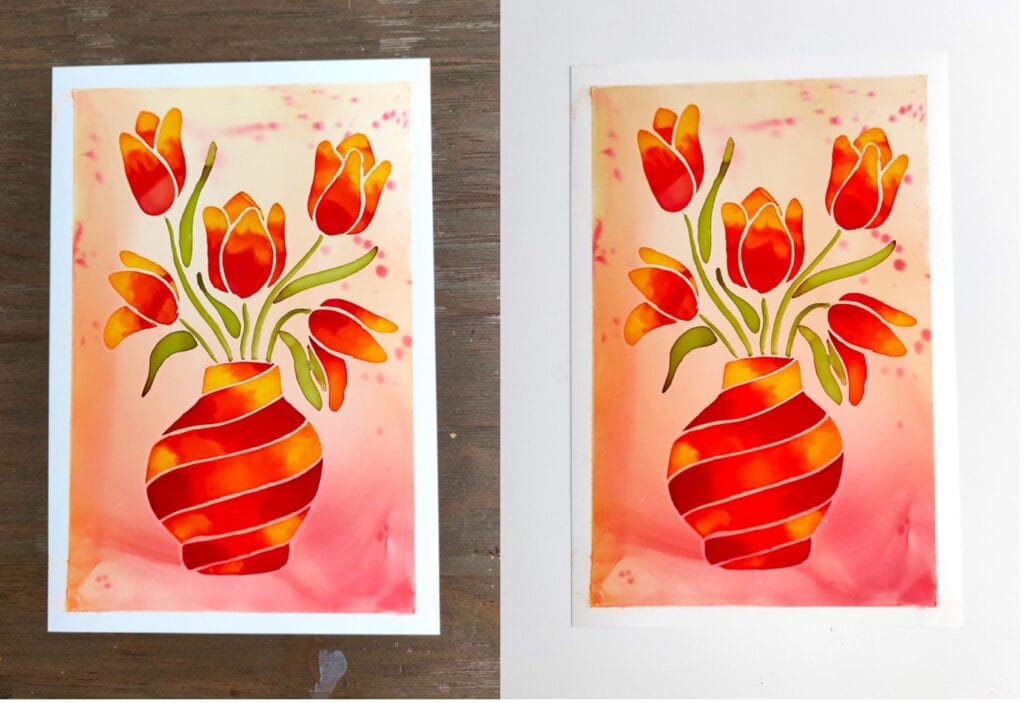
2. Use a neutral (white) background
I like to use a white background when taking photographs as it elevates the colors in the artwork. Avoid using colored or patterned backgrounds, as they can distract from your artwork.
Tip: use a large sheet of white (synthetic) paper as your background on your table, or tape it to your wall when you don’t have a white wall in your house.
Another benefit of using white is you can use this to edit the white balance in your pictures (see my tip for editing pictures).
Here you can see the difference between using my wooden table as the background versus a white background:
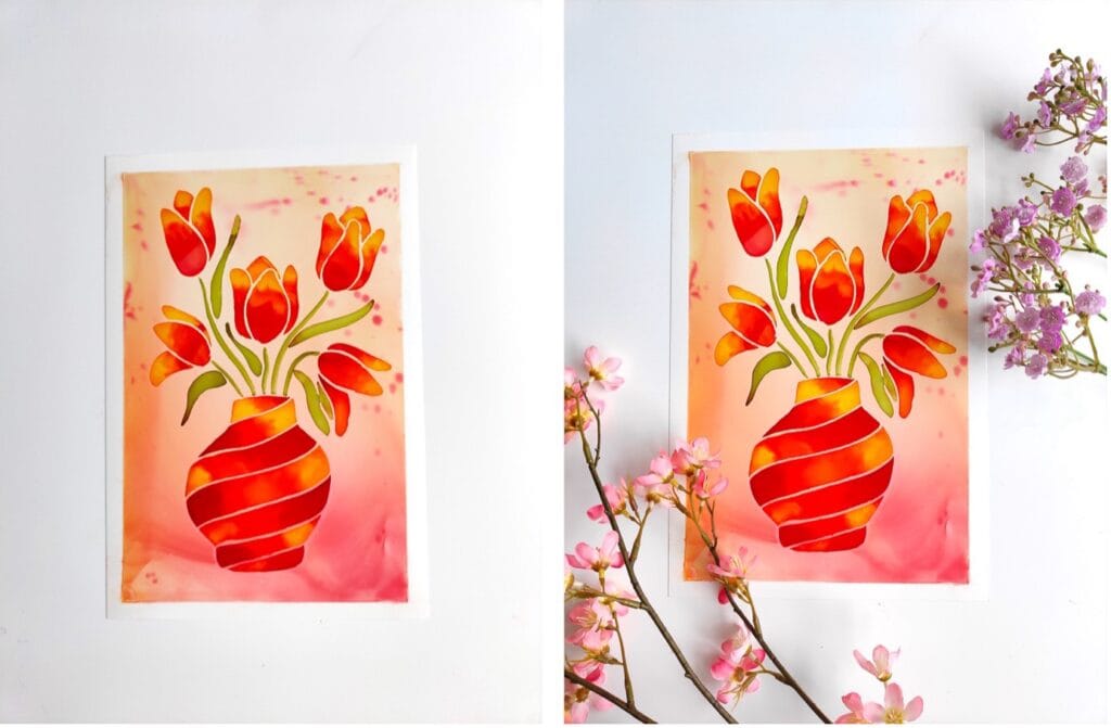
3. Use attributes to add interest
Adding attributes is one of the easiest ways to make your photos more interesting. I like to use fake silk flowers or dried flowers for my photos (or real ones if I happen to have those in my studio). Other options are to have some of your tools like a few bottles of inks around your artwork and place them in a playful composition.
Here you see the difference of a plain white background versus one with some flower attributes. It makes all the difference, doesn’t it?
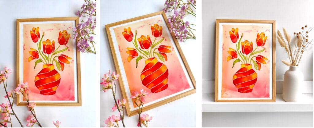
4. Frame your artwork
If possible, frame your artwork in a picture frame or a matte. This is another great way to add interest to the photograph and helps elevate the artwork.
One thing that is a bit annoying when using a picture frame is that the protective film will usually reflect. My tip: get rid of it for the photographs so there’s no reflection messing up your picture.
Here you see the artwork framed and unframed, see how it elevates the artwork?

5. Experiment with angles
Experiment with different angles to capture the best shot of your artwork. Consider shooting from different heights and distances to create different perspectives. You can also try shooting your artwork from an angle, rather than straight on, to add depth and dimension to your photos. Of course you can also shoot your artwork on a wall or like I show below, on a picture ledge.
I usually take at least 10 pictures and then pick the one I like most. I often like pictures better from a bit of an angle because they look a bit more playful and less staged, but it totally depends on my mood 😊 If you’re taking pictures for your website, it can be great showing the artwork at an angle AND straight so your clients can see it from different angles.
Here you see a straight flat lay shot versus one from an angle, and shot in a different setting, which one do you like most?

6. Photographing metallic inks
Alcohol inks with gold metallic pigments can add a stunning shimmer and shine to your artwork, but they can also be challenging to photograph accurately. The reflective properties of the gold metallic pigments can make it difficult to capture the true beauty of your artwork.
Lightning: Experiment with different light setups to find the best way to capture the metallic shine of your artwork. Use diffused natural light or artificial light sources, such as lamps or LED lights (e.g., the IKEA lamp). Consider using a lightbox or a reflector to direct light onto your artwork and highlight the metallic pigments.
Angle: Position your artwork in a way so that it reflects the metallic pigments. I usually position my artworks towards the window by elevating one side of the artwork with some props. It also helps to take the picture from an angle with your smartphone until you see your artwork reflecting the light.
Here you see the differences of taking a picture straight ahead versus at an angle so that the metallics reflect in the natural day light. I also lifted up the left side of the frame in the right picture by putting some props underneath.

7. Edit your photos
I ALWAYS edit my photos before posting them on social media or on my website as it can make a huge difference. I’m not going into all the editing apps out there, but what already makes a huge difference are these settings (which you can easily edit within Instagram):
- Increase brightness (I go for max 15)
- Increase contrast (max 10)
- Increase saturation (max 5)
- Adjust temperature: my pictures are usually a bit yellow/green like so I take down the temperature to a more cold setting (usually about -10)
Want to take it a step further?
The number one edit I do in Photoshop (since it’s not possible in Instagram) is adjusting the white balance. I add a filter that will choose the white color in the image and it will make the colors in the picture SO much better and true to life. It’s similar to setting the temperature in a picture, but a more advanced way as it will automatically adjust the colors in your picture.
If you happen to have Photoshop, here’s a super quick demo of how to change white balance in your picture easily.
Please note: Be careful not to over-edit your photos, as this can make your artwork look unrealistic.
Here’s an example of an unedited and an edited picture, see the difference? I only adjusted the white balance for this one.

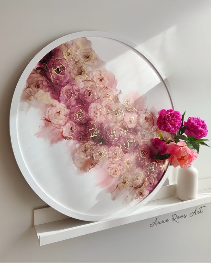
8. Use an app or mock-ups!
If you want to showcase your art in different settings or rooms, you can also use a wall art visualizer ap. You will need to upload a clean version of your artwork in high quality format (so a flat lay of your artwork without any background). For example, wallapp and frameit are (partly) free apps that will help you showcase your artwork in different rooms. It’s a great way to showcase your artwork more professionally if you’d like to sell your art, and give the buyer a good idea of what it may look like in situ. Moreover, you can also experiment with different framing options and see how the art looks with various mats and frames. There’s many different types of apps on the market (both free and paid).
An alternative to these apps is purchasing mockup images of different rooms that you can edit in Photoshop if you’d want a more professional look (of course this takes more time and some basic editing skills). You can find many of these on Etsy.
I personally mostly only use this for bigger artworks since they are more difficult to photograph in situ and on a wall. I usually go for a very clean look of the artwork. It all depends on your personal preferences!
Here you can see an example of one of my artworks photographed in situ compared to edited in a mockup image. I showcase both on my website to give a good idea of what the artwork looks like.

In conclusion, photographing artwork (with alcohol inks) can be challenging, but by experimenting with these tips and tricks, you can hopefully better capture the beauty and vibrancy of your artwork accurately. Now, we all have a life and other things to do, so even applying just 2 or 3 of these tips can make all the difference! I don’t always have the time or energy but I always try and apply a few of these.
Bonus tip: Photograph and edit a bunch of artworks at once to save time!