The element of an artwork that can make or break an artwork is its composition. You know that feeling when something just feels off about your floral piece? Often times there’s just something about the composition that just isn’t quite right! It’s also the element that most creatives, including myself, have most trouble with. So I thought this would be a good opportunity to give some tips and tricks on creating a floral composition. Before you start reading, I would like to emphasize that these are merely guidelines, it’s not a strict rule to always follow as I will also explain in the end.
Before you start reading the tips: Which of these two compositions do you find more appealing? Can you tell why?
What is a composition?
Composition is the way we arrange the different elements in our artwork, in our case, the flowers. Very simply said, it’s the arrangement of our artwork. Just like a bouquet of flowers is arranged by the florist, we arrange the flowers in our artwork.
There are many things that can be considered when creating a composition. In this part I will mostly focus on the arrangement of flowers in our composition, and not so much on other elements that can help the composition, such as color and contrast.
Are you ready?
Here’s my 6 tips and tricks for creating a floral composition I have gathered over the past years:
1. Asymmetry and the role of odd numbers
We often have the tendency to go for perfect symmetry when creating an artwork, because it feels as if we are creating a perfect balance that way. However, asymmetry is much closer to nature if you think about it. Ever seen a perfectly symmetrical flower? Symmetry is just a little too perfect to be true to nature. Imperfection and asymmetry often add more interest to an artwork, while perfect symmetry can be a bit boring and redundant.
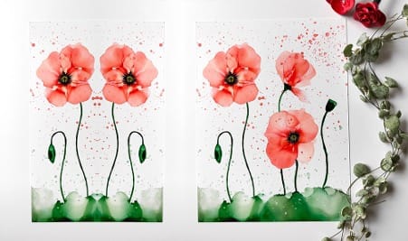
Take a look at my poppy artworks below. Left shows perfect symmetry (this is photoshopped obviously), right shows asymmetry in how the flowers are arranged. Did you prefer the right one when I asked you your preference at the start of this piece? It may be due to the asymmetrical composition!

How can you create asymmetry in a piece?
We can create asymmetrical balance: “the technique of using differing visual elements of unequal weight on both sides of a composition to achieve a sense of balance”. Read more about this here.
- When building compositions we can arrange the flowers in an asymmetrical way to create more interest. We can do that by adding our florals at different heights and by differing in the shape and size of our florals (more about shape and size in tip 4)
- The role of odd numbers: asymmetry can also be achieved by adding an odd number of flowers, so 3 or 5 florals instead of 2 or 4. This makes it easier to achieve an asymmetrical balance.
Having said that, I have created many pieces with only two flowers that look just fine. But I do have a preference for my floral compositions with three flowers as you may have noticed if you have been following my floral tutorials.
2. Guide the viewers’ eyes
Creating asymmetrical balance also helps to guide the viewers eyes and, in that way, add interest. We do this by arranging the flowers in such a way that the viewing pattern is guided through the entire arrangement of the flowers. If there’s perfect symmetry, there’s less guidance in where you should look in the artwork (see example above). There’s two ways I like to guide the viewers eyes in my artworks:
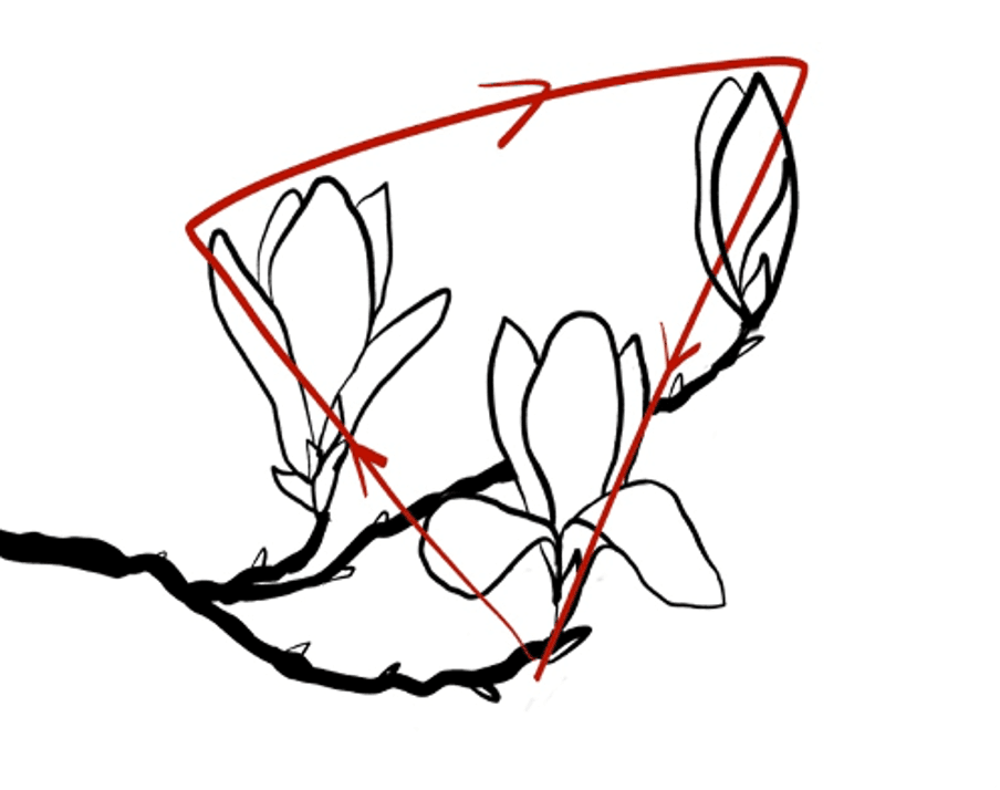
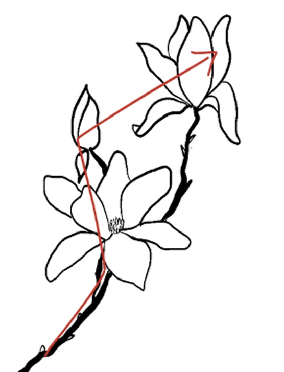
- Create a triangle viewing pattern (left example in picture below) – this works well when you have a floral composition of three flowers
- Create a zigzag, S-shape, or diagonal viewing pattern (right example in picture below)
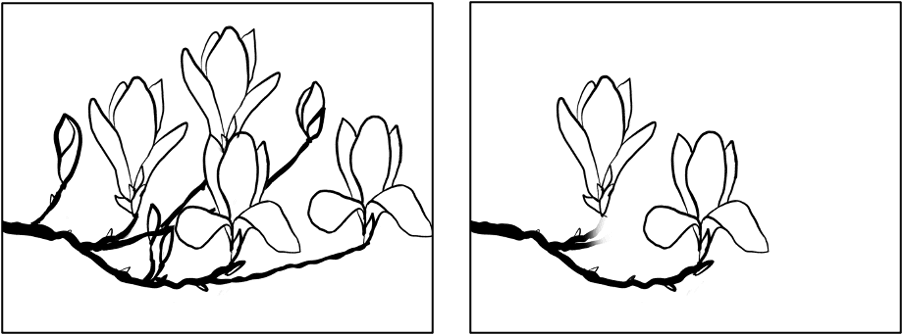
See the two magnolia compositions I created on my iPad. Left you see the triangle viewing pattern, while on the right you see more of a zigzag, or diagonal viewing pattern. You also see me often use the diagonal when creating more abstract pieces, like the fluffy floral compositions also pictured further down below.
3. The use of different shapes and sizes
Another way to make the composition more interesting is by using different types of shapes and sizes. For flowers we can easily create different shapes by creating different versions of our florals, think: sideview versus front view, opened and unopened flowers (buds) and varying the size of our florals and the shapes of our petals. The poppy artwork is another good example of that. With alcohol inks that goes quite naturally, as it is almost impossible creating exactly the same flower shape each time.
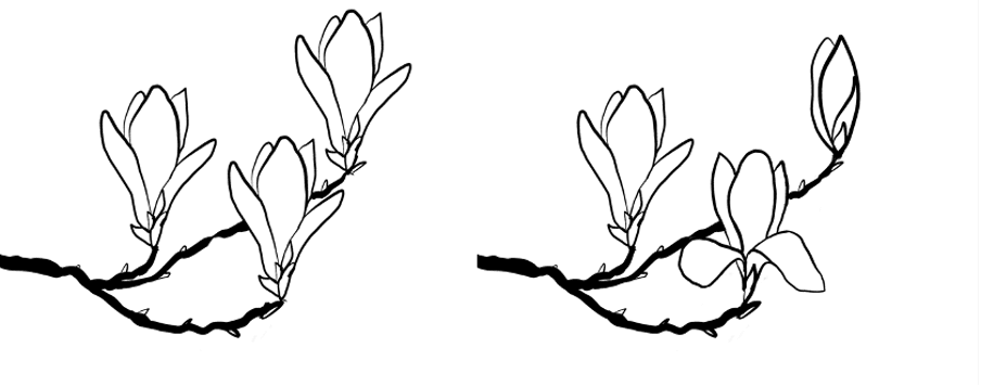
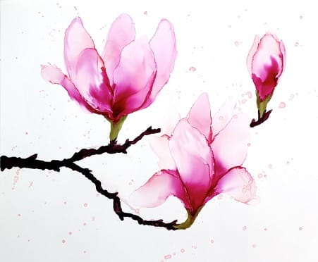
See the magnolia example again, but now with exactly the same flower repeated three times (left) versus the original (right). Do you see how differing the shapes of the magnolias already adds much more interest to the piece?
Moreover, for some florals we add branches, stems, and leaves, all different types of shapes that can add interest to a piece.
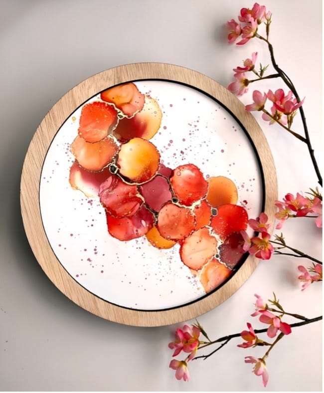
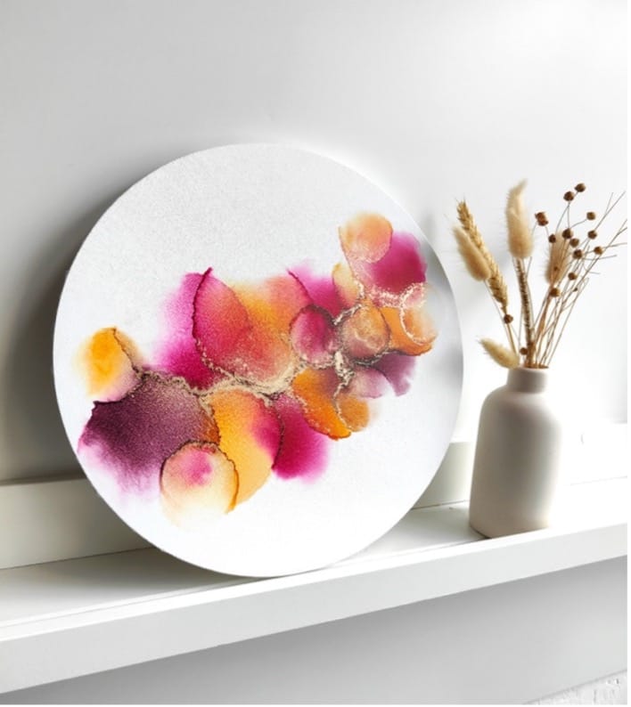
In case I work with very similar shapes, like pictured below, it can help to vary the size of the shape to add interest. See how the right example creates more interest by differing the sizes of the circle shapes? It’s not that the left is not nice, but by using the same shape over and over it becomes a bit too symmetrical (remember tip 1).
One last way to add shapes to our floral composition is the way the flowers are arranged. If you check out the magnolia composition above, the magnolias together create a triangle shape. Moreover, while I use the same circle shape in the artworks above, the diagonal line adds another shape to our artwork. This is a trick that is often used by artists as well, and aligns with the viewing pattern discussed in tip 2.
4. Less is more!
A composition that is too full of flowers is not very attractive and can be too busy to look at. It doesn’t really help in guiding the viewer (tip 2) as they have no clue where to look. Leaving enough negative space helps in creating a focus point (see next tip), guide the viewer and makes the artwork more calming to watch. So when you work on your floral composition, make sure you do not stack the entire piece with flowers. You want to leave enough space around the flower and not overlap them too much.
The opposite can also be true though. Having one very empty area whereas the rest is filled, can be unattractive. So we should meet in the middle: creating an attractive composition that guides the viewer through the entire surface we use for our artwork by arranging our flowers across the surface.
While the left example may be too full of flowers, the right may have a bit too much negative space on the right side.
5. Create one central focal point and build your composition around it
When you build an artwork with several, separate flowers (like the magnolias), it can help to start with creating one main central flower close to the center of the piece, and build your composition around the central flower. While you could plan out the entire composition beforehand (which I sometimes do), it can be difficult and limiting when trying to copy something you sketched out beforehand. Often times, your first flower will turn out much bigger than anticipated and the rest of the composition may not fit in anymore. By first creating the main, central flower, you can then start building the composition around it by adding smaller flowers around it that support the composition. See if you can apply some of the first four tips here in creating different shapes, guide the viewer, and creating asymmetry in your artwork.
6. Use these tips and tricks as guidelines, but stay open to surprise and experimentation!
While these tips and tricks can be helpful in creating aesthetically pleasing floral compositions, stay open to surprise and experimentation. Following these tips as strict rules may limit your creativity, so I advise you to use these as mere guidelines that can be used to figure out how you want to continue your floral composition when you’re stuck or you feel your piece is still missing something. Therefore, my best advise it to follow tip 5 and start with your first flower, and start building your composition from there. Have fun and play with these guidelines!
More importantly, is doesn’t mean if these rules do not apply to your artwork it is no good.
By all means check out my work, you will find many examples both in my tutorials and my work in general where not all of these rules apply. If you look at my bouquets of roses artworks, barely any of these rules are followed yet they are my most popular artworks!
Apply these tips and tricks:
Want to have a little fun with this? Sketch some different compositions in which you try and apply some of these rules (or not) and see which ones you find more appealing.
It can also be fun to have a look at other artists floral compositions and see if you can discover whether they (unintentionally) followed some of these guidelines.
Do you have any tips to add to the list? Feel free to comment, I’d love to hear yours!
Would you like more guidance in working with alcohol inks to create floral artworks that draw the viewer in? In my online courses, I do not only demonstrate how to create specific flowers (like the flowers shown in this blog), but I also show you how to build a composition from start to finish so you will have a finished artwork at the end of my tutorials! Just click here to learn more about my online courses.